This post exists for one reason: to make sure Cozy Reader handles every kind of WordPress content correctly. If you are reading this in the app, something worked. Paragraphs with tricky descenders — the g, the p, the y, the q, the j — should all sit comfortably without their tails being clipped by a tight line height.
Why a Test Post?
Building a reading app for WordPress is an exercise in handling the unexpected. Every site produces slightly different HTML. Some wrap images in figures with captions. Some use blockquotes for pull quotes. Some write long paragraphs, some write short punchy lines. A dedicated test post pins down all the variations in one place so they can be verified on device.
This post was generated during the development of Cozy Reader by Richard Morrison at Automattic. It lives on breathofthehorizon.blog and gets imported whenever a fresh install of the app needs something real to read.
What Gets Tested Here
The sections below cover the full range of Gutenberg block types that appear in typical blog writing: headings at two levels, paragraphs with bold and italic text, a blockquote, both kinds of lists, a code block, an image with a caption, and a standalone link.
Block Types
Paragraphs and Typography
Body text should render in Literata at a comfortable reading size. Longer paragraphs — the kind that fill several lines and ask the reader to settle in — are the real test of line height and spacing. The quick brown fox jumps over the lazy dog. Sphinx of black quartz, judge my vow. Pack my box with five dozen liquor jugs.
Descender check: Typography gives printing its personality. The depth of a g or p or y below the baseline is the mark of a well-drawn typeface — and the mark of a reading app that handles line height properly. Pretty typography pays its respects to the glyphs.
Inline formatting: text can be bold, italic, or bold and italic together. These should all render without falling back to the system font mid-sentence.
Blockquote
Reading is not just the consumption of words. It is the experience of being somewhere else entirely — another mind, another morning, another way of seeing the same world. A good reading app disappears. You stop noticing the app and start noticing the words.
Cozy Reader, build notes, April 2026
Unordered List
The following is a bullet list. Each item should appear with a bullet character and comfortable spacing between lines:
- Paragraphs — the core unit of prose writing
- Headings — hierarchy at H2 and H3 levels, visibly larger than body text
- Blockquotes — indented, with a coloured left bar
- Bullet lists — like this one, with comfortable spacing between items
- Numbered lists — for when the order of things actually matters
- Code blocks — monospaced text with a distinct background colour
- Images — full width, with an optional caption below
- Links — tappable, opening in the system browser
Ordered List
The same content as a numbered list, to test ordered rendering:
- Add a WordPress blog by pasting its URL into the app
- Posts are fetched and stored locally for offline reading
- Bookmark posts you want to return to with the diamond button
- Mark posts unread from the reader menu to revisit them later
- Switch themes — Paper, Linen, Lamplit, Nordic, Nordic Dark
- Adjust font size and line spacing from the reading controls
Code Block
A code block should appear with a monospaced font and a visually distinct background — different from the reading surface behind it:
// WordPress REST API — post object (simplified)// This is what Cozy Reader receives when it fetches posts.{ "id": 42, "title": { "rendered": "Testing Cozy Reader" }, "content": { "rendered": "HTML content here." }, "date": "2026-04-22T12:00:00", "link": "https://breathofthehorizon.blog/2026/04/cozy-reader-test-post/", "_embedded": { "wp:author": [{ "name": "Richard Morrison" }], "wp:featuredmedia": [{ "source_url": "https://example.com/image.jpg" }] }}
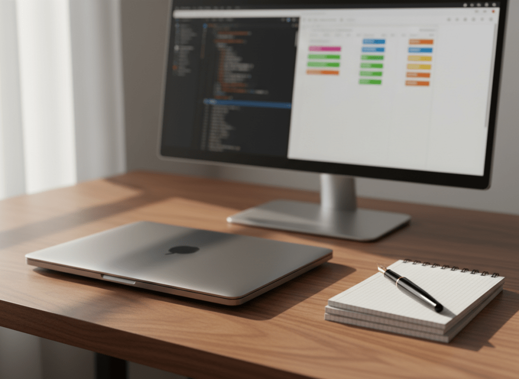
Image with Caption
The image below should render at full content width with rounded corners. The caption should appear below it in a smaller italic style:

Link
This paragraph contains a link to quietbuilds.blog, which is where Cozy Reader is being built and documented. Tapping it should open the system browser at the correct URL. The link text should be visually distinct from surrounding body text — typically the accent colour.
The Reading Experience
If all of the above looks right — proper spacing, readable type, tappable links, images with captions, code blocks with distinct backgrounds, lists with clean bullets and numbers — then the rendering engine is doing its job.
The goal was never to replicate a browser. The goal was to make reading feel like reading. A calm surface, good type, no noise. The content should be the only thing you notice. That is the benchmark for every decision made in building this app.
