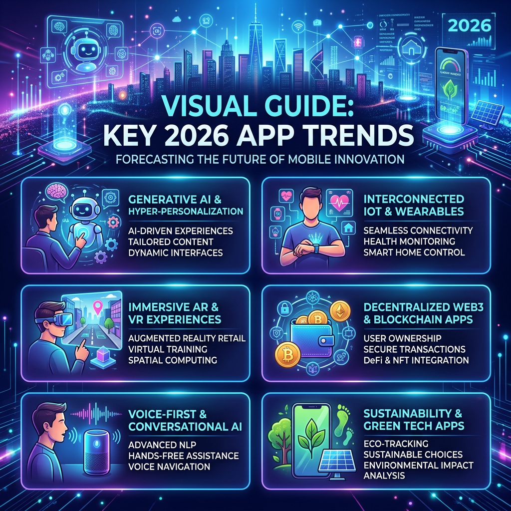
There is a design article doing the rounds at the moment about mobile app trends in 2026. It is a good read. It covers AI-driven interfaces, zero-click navigation, gesture-based interactions, dark mode as a starting point rather than an afterthought. Most of it is written for product teams chasing engagement numbers and retention dashboards.
But a few of the ideas in that article describe something different. Something quieter. And those are the ones I have been thinking about while building Cozy Reader.
The Friction Problem
Modern reading apps have a friction problem that nobody talks about honestly. It is not the loading times or the typography. It is the three-tap tax.
You pick up your phone. You want to read. You open the app, find the library, find the blog, find the post you were halfway through. By then you have made four decisions and tapped six times. The moment has already cooled slightly. Reading feels like a small administrative task rather than a pleasure.
The 2026 design article calls this the zero-click navigation problem. The best apps reduce effort aggressively. They surface what you need before you go looking for it. They remember where you were.
That idea led directly to one of the most satisfying features I have built for Cozy Reader so far.
The Continue Reading Card
The implementation is simple to describe: when you open the library and you have a post that you started but did not finish, a quiet card appears at the top of the screen. It shows the blog icon, the post title, the blog name, and a thin progress bar showing how far through you are. Tap it and you land exactly where you left off.
When you are fully up to date and have no posts in progress, the card simply does not appear. There is no empty state, no placeholder, no “nothing to continue reading” message. Just the library, clean and calm.
That last part matters more than it might seem. A lot of apps would show a disabled state, or a greyed-out card with an explanatory label, or nothing but a noticeable absence where something usually sits. All of those choices add a small cognitive cost. You notice the gap. You process it. You move on.
The better choice is silence. The card earns its place on screen only when it has something useful to say. This is what the 2026 design article calls minimalism with actual meaning. Not empty space for aesthetic reasons. Not removal for the sake of appearing clean. Removal because there is genuinely nothing to show.
Micro-interactions That Communicate
The same design session also produced something smaller: rotating loading messages.
When you add a new blog to your library, Cozy Reader fetches the site and downloads recent posts. On a slow connection this can take several seconds. The old version showed a spinner and a static label that said “Fetching posts.” Accurate. Completely inert.
The new version cycles through a short list of warm, unhurried messages. “Reading the front page.” “Gathering your chapters.” “This blog has a lot to say.” Each one fades in and out on a gentle transition.
The 2026 article describes micro-interactions as communication rather than decoration. A well-placed animation does not just look nice. It tells you something. In this case it says: the app is working, it is not stuck, it is worth the wait. That reassurance has real value when you are staring at a spinner wondering whether to abandon the import.
The key constraint is restraint. One unnecessary animation and the whole thing tips from calm into fussy. The messages are short, the transitions are subtle, and the interval is long enough that you read each one before the next arrives. It is deliberately slow. Reading is not supposed to feel rushed.
Swipe to Mark as Read
The other feature I shipped takes a different approach to the same friction problem. In the chapter list, you can now swipe a post to the right to mark it as read. The accent colour slides in from behind the row, a checkmark appears, a light haptic tap confirms the action.
Android users have been trained on this pattern for years by Gmail. Swipe right to archive. Swipe right to mark done. The muscle memory is already there. The interaction is learnable by accident the first time your thumb drifts across the screen.
What makes it work in Cozy Reader specifically is the constraint on when it appears. The swipe action only reveals itself on unread posts. If a post is already read, swiping does nothing. There is no spring-back animation, no cancelled gesture, just the normal scroll behaviour of the list. The gesture only offers itself when it has something useful to do.
This is a pattern worth naming. I think of it as quiet redundancy. Features that cannot do anything real simply do not appear. No disabled states. No explanatory labels. No interface archaeology required to understand why something is greyed out. The app only shows what it can actually deliver.
What 2026 Gets Right, and What It Misses
The design article is correct that the best apps in 2026 feel fast and personal and smooth in a way you do not consciously notice but definitely miss when it is gone. That description fits what I am trying to build.
But some of those trends are not right for Cozy Reader. AI-driven interfaces that quietly rearrange themselves based on behaviour patterns sound sophisticated. In a reading app they would be disorienting. Part of what makes reading feel calm is that the environment stays still while the words change. An interface that rearranges its priorities between visits would undermine exactly the quality that makes the app worth using.
The same logic applies to streaks, notifications, and engagement mechanics. Those tools are designed to bring you back. Cozy Reader is designed to be there when you arrive. The distinction sounds small but it shapes every decision.
Design in 2026 is at its best when it serves the person rather than the product metric. The continue reading card does not increase sessions per day. It makes a single session start better. Those are different goals, and only one of them is worth optimising for.
The reading experience is the product. Everything else serves it.

Leave a comment